This website was very useful because it listed what specific information to include, and even added visual examples to make it even more clear.
I have also been looking at different layouts that I like so we have different options to choose from. Here are some layouts I like and some I didn't:
 |
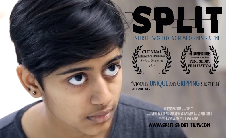
| I like the layout because it highlights the image and the subject. I don't like how there are a lot of different fonts because I think there are too many. The font choice for the title of the movie is very engaging and interesting. |
 |
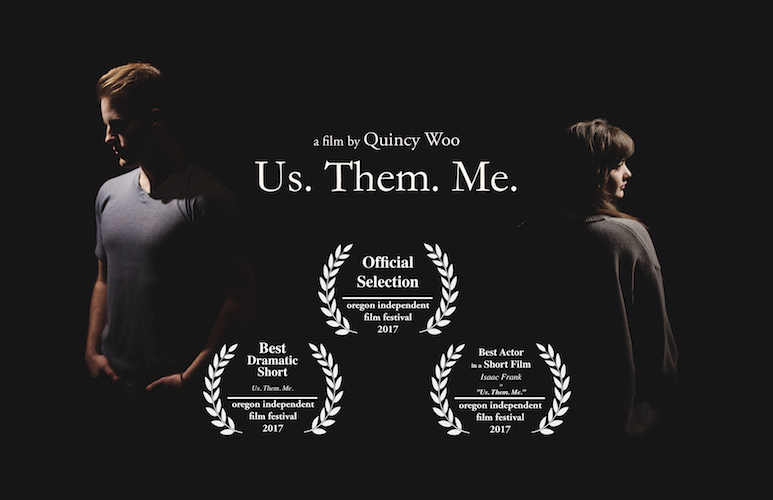
| I like the image because it is very evocative, but I don't like how the awards are on the front. I would have liked it better if they just left the director and title with the image. |
 |
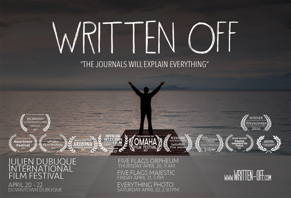
| I like the colors and text. I also like how they included a tagline from the film. I don't like the gray box at the bottom. If they had just left the picture normally without the gray or put that information on the back it would look better. |
 |
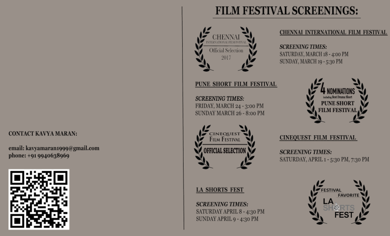
| (Back of the first flyer) I like this layout because it is very easy to read. Everything is spaced out in a cohesive way. I also like the added touch of the QR code, and I think I want to include that in my flyer. I don't like the color of the flyer, or how small the contact information is.
Sources:
kavyamediastudiesa2. “A2 Media – Short Film.” A2 Media Short Film, kavyamediastudiesa2.wordpress.com/category/postcard-advertisement/.
Quincy Woo. “Us. Them. Me. at the Oregon Independent Film Festival.” Quincy Woo, Quincy Woo, 3 Sept. 2017, www.quincywoo.com/journal/2017/9/2/us-them-me-at-the-oregon-independent-film-festival.
Biscuit. “Julien Dubuque International Film Festival - Iowa.” Written Off, Written Off, 19 Apr. 2017, www.written-off.com/film-news/2018/2/7/julien-dubuque-international-film-festival-iowa.
|


No comments:
Post a Comment